Fraunhofer ISE
The Energy Charts: Online Data Platform Relaunched Today with New Features
The data platform energy-charts.de of the Fraunhofer Institute for Solar Energy Systems ISE is the most comprehensive database for power generation in Germany. Since 2014, the site gathers data on power generation from various neutral sources and makes it accessible to the public. The site has been further developed in the InGraVi project which was funded by the Deutsche Bundesstiftung Umwelt (DBU) and is now ready for relaunch. Changes were made so that the correlations between different data categories can be more quickly understood. DBU Secretary General Alexander Bonde remarks, "The energy transition is a generational task which must be implemented quickly. Digital platforms such as the Energy Charts help to objectify the discussion. What effect does CO2 pricing have? This will become more transparent with the relaunch: The website now correlates new data, such as electricity exchange prices and CO₂ prices, so that it becomes clear at what cost level coal-based electricity generation is no longer profitable for power plant operators.


New Data Categories
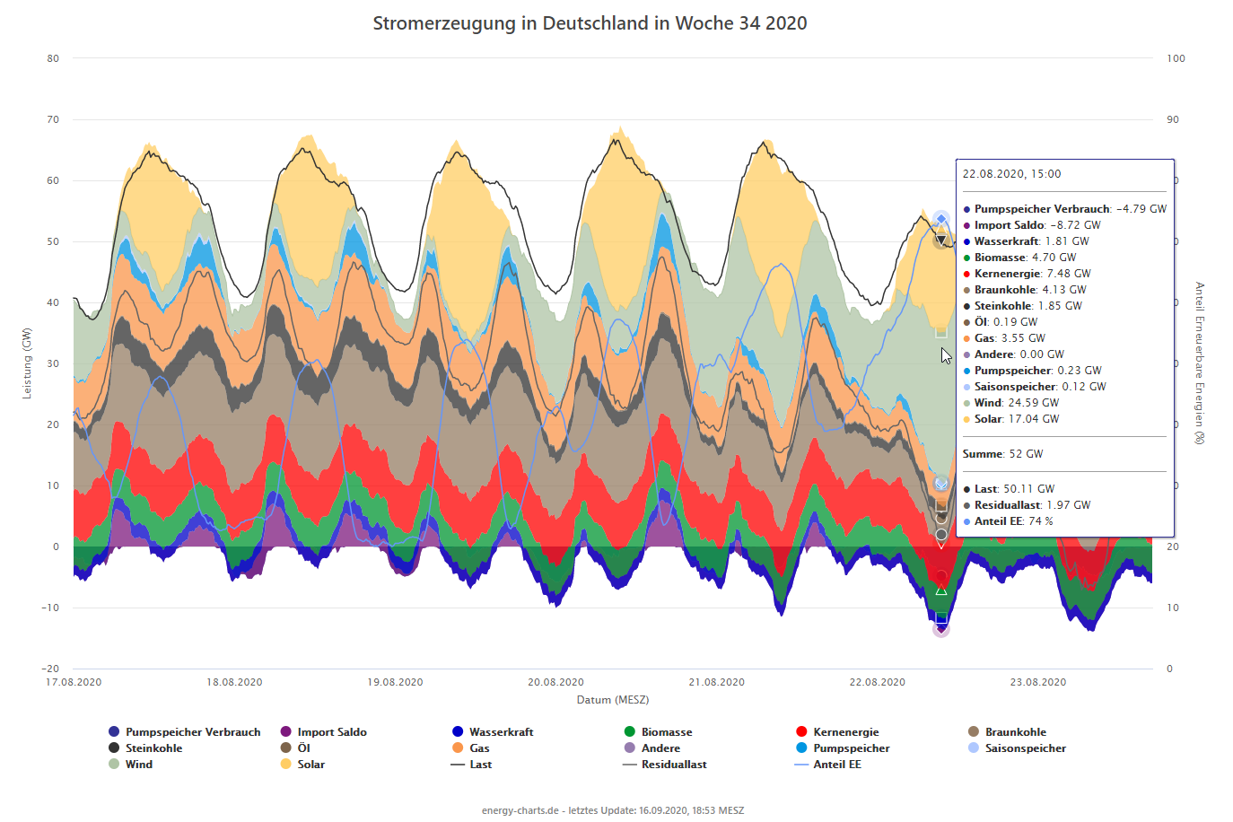
With the relaunch, users can not only display the load as part of the performance data, but also the residual load. (This is the difference between total system load and the load met by fluctuating generation from renewable energy sources RES, or in this case the generation needed from conventionel power plants.) The share of renewables in the electricity generation can now also be displayed in fifteen-minute intervals. And, at the request of many users, electricity generation and consumption by pumped storage power plants is now integrated. For better readability, the numerical values can be displayed directly on the visualized graph.
A new feature is the responsive map of Germany, which displays infrastructure data (e.g., power plants), the areas belonging to each of the transmission system operators as well as the current weather data from the various German Weather Service stations. The user can create their own "heat map", in which the values for e.g. solar radiation, wind speed, precipitation, hot days or frost days are represented by different color gradations.
CO₂ Price as Effective Lever
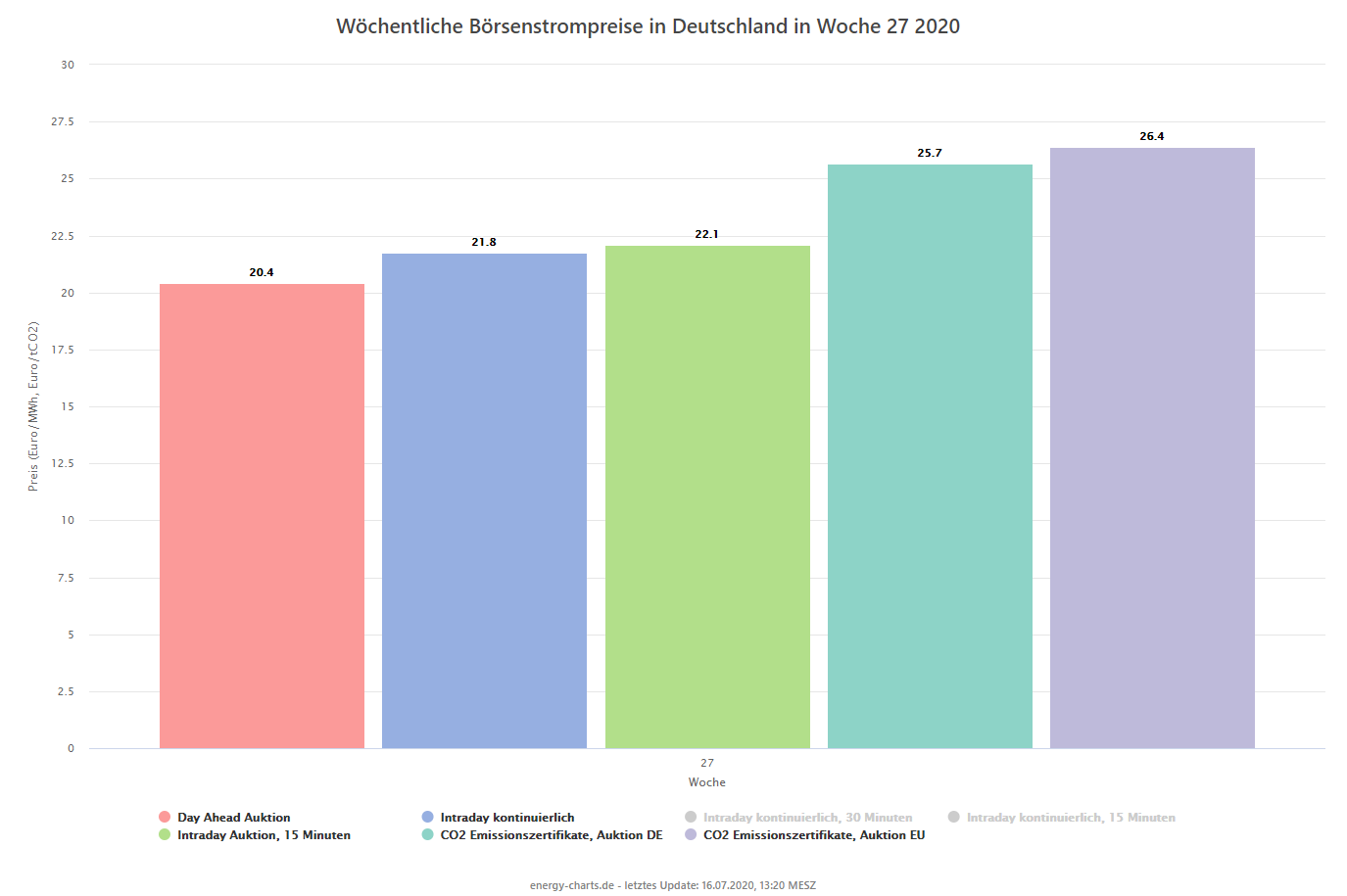
The CO₂ price is an important lever for the decarbonization of the energy system. Therefore, the category "prices" in the Energy Charts now includes the current prices of the CO₂ emission certificates, which were determined at the German and EU auctions. These can be compared with the current price on the electricity exchange. "Now it is possible to see at a glance whether coal-based electricity generation is still economical for power plant operators or whether the power plants are making losses,” explains Prof. Dr. Burger, who created the Energy Charts at Fraunhofer ISE. For example, lignite-fired power plants produce an average of about 1.1 tons of CO₂ electricity per MWh electricity generated. With a certificate price of around 25 euros, operation is economically viable only with an electricity exchange price starting at 27.5 euros/MWh.
More User-friendly
Another focus of the InGraVi project is to improve the user-friendliness of the site with a new design. "We have improved mobile usability through a responsive design, as many users now open the energy charts on smartphones or tablets and have added a modern interface to visually enhance the site," explains Prof. Bruno Burger. The site has also been optimized for use in lectures or seminars.
The next steps will include, among other things integrating data from the European satellite Sentinel 5P, which measures nitrogen oxides, carbon monoxide, sulfur dioxide, methane, particulate matter, etc. These pollutant values will be linked to other data categories, such as power plant locations and wind directions, to show the impact of individual power plants on air quality.